Colour SS 2022
Update
Spring/Summer 2022
COLOUR UPDATE
This colour update contains Spring/Summer 2022 colours for home, fashion and sports. The palette has sixteen new colours that work together with the 2022 palette, to create the right summer atmosphere. You can use the sixteen colours as a separate Spring/Summer 2022 palette. For an even more vibrant colour experience, you can link these colours to the existing 2022 range and mix the different tones and hues.
Below, you can see the palette arranged tonally. The palette consists of a range of blue colours, dusted pink and lilac shades, warm yellow and orange tones, and a variety of colour shades from yellow to green. Horizontally combining the colours creates tonal atmospheres, vertically combined the combinations are unique but still harmonious. The colours have brightness in them, and you sure can make a colour statement, but they also have a softness to them. All colours can be used for head to tone summer outfits, for larger surfaces as well as accent colours.
In general, the added colours represent a world that is becoming more nuanced with an array of perspectives from an understanding that there is not just one viewpoint. By having a more diverse view, new rich worlds develop. Human nature needs healing, and these colours support a slower pace of life and a more significant connection with nature and with ourselves. The colours offer comfort, they are subtle yet they are very present and cannot be overlooked.
SS 2022 TONAL PALETTE
You can download the Adobe ASE palette here
Click here to see the non-seasonal and summer 2022 colours of the original Colour Flow 2022 palette.
1/Eastern Perspective
SLOW LIVING
ORIGINAL PALETTE EASTERN PERSPECTIVE
Four new colours provide warmth, brightness and sophisticated femininity to the existing palette of Eastern Perspective. The colours add romance, mystery and history and they seem to slow down the pace of existence. The colours come to life through the textures in which they are used, such as cracked glaze, porous stone, woven structures and light-weight fabrics.
About the colours:
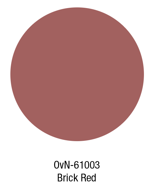
Glaze is a dusty turquoise that refers to old ceramic glazes stained by time and use. The warm Ginger Orange tone combines beautifully with the top row of the original palette and with the red tones. Brick Red is a dusty red terracotta that adds warmth to the palette, and Wisteria gives the palette a sophisticated touch.
2/Altered Earth
AWARENESS
ORIGINAL PALETTE ALTERED EARTH
The Spring/Summer 2022 colours for Altered Earth add warmth and a desert-like touch to the original palette. A new soft green represents the positive power of nature, the bright blue represents water, necessary for all life on Earth. Life is intricate, and the Earth’s processes are in constant motion. We have finally understood that we are part of nature and that we depend on it for our breath and our well-being. The future ecosystems and all new products that are being developed should reflect this knowledge.
About the colours:
Neutrals are essential for Altered Earth, and a warmer neutral is added to the palette of Spring/ Summer, called Spelt. Seedling is a soft, friendly green and Rise is a warm dusty red tone. The colour Shore is a bright blue that is clear and decisive, an active colour that reminds us of clear water, blue skies and freedom.
3/ History, Future, Now
FREEDOM AND PERSONALITY
ORIGINAL PALETTE HISTORY, FUTURE, NOW
The summer colours of History, Future, Now are sophisticated tones that add a light and airy touch to the original palette. The range has a feeling of the '70s; the vivid green, orange and brown tones remain essential for Spring/ Summer 2022. The palette mixes colours and materials in unexpected ways, to emphasise unique views and individual expressions. The colours represent a broader view of the world and opening up the horizon as well as zooming in on local traditions and expressions. Change in society is necessary to move to a more fair world, open up to designers and colour use from all over the world, especially those parts that are not familiar. Expressing ourselves through colour is an abstract language that connects us.
About the colours:
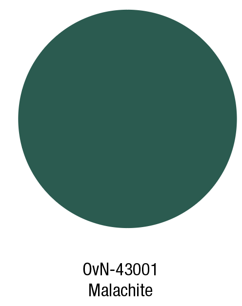
The colour Ground is a greenish neutral that works well with both pastels and bright colours. The green Malachite colour represent the wonders of nature and the abundance of what nature offers. The pale green Dew and the soft yellow Delight add lightness, sophistication and elegance to the palette.
4/Neuro Aesthetics
THE SOFTER SIDE
ORIGINAL PALETTE NEURO AESTHETICS
The Spring/ Summer colour update of Neuro Aesthetics represents the human and softer side of the technologically advanced world we live in. The atmosphere has something otherworldy and post-human as if human-created worlds and also physical objects become own individuals. The physical and digital blur and become one, like never before. Protection is essential, from radiation, electromagnetic fields and viruses, colours and materials act like protective shields. Colour effects are crucial, the colours blur and shift into each other, creating colourful sprays, gradients and effects in finishes. The colours act as lighter additions to the original palette making the shifts in a tone more smooth and gradual.
About the colours:
Quartz is a soft greyish pink that can function as a neutral. The Blue World colour is a bright and clear blue that can also be used for larger areas. Phantom is a dusty purple that combines beautifully with the greys of the original palette. The Rise colour is a warm apricot that glows and lights up the range.
Banner image Thought Process by Ana Montiel
You can download the Adobe ASE palette here
If you would like to order the 16 swatches of the SS 2022 palette you can contact us here
Colour References
OvN-45005 Glaze
15-4714 TCX Pantone, Aquarelle
61-13-28-0 CMYK
OvN-21006 Ginger Orange
14-1133 TCX Pantone, Apricot Nectar
4-40-58-0 CMYK
OvN-61003 Brick Red
18-1630 TCX Pantone, Dusty Cedar
25-68-52-17 CMYK
OvN-56004 Wisteria
17-3612 TCX Pantone, Orchid Mist
49-55-22-5 CMYK
OvN-32002 Ground
17-0610 TCX Pantone, Laurel Oak
45-34-48-18 CMYK
OvN-43001 Malachite
19-5420 TCX Pantone, Evergreen
87-37-65-35 CMYK
OvN-45006 Dew
12-4806 TCX Pantone, Chalk Blue
24-8-16-0 CMYK
OvN-21007 Delight
12-0711 TCX Pantone, Lemon Meringue
6-10-49-0 CMYK
OvN-12003 Spelt
13-1014 TCX Pantone, Mellow Buff
13-24-40-2 CMYK
OvN-23003 Seedling
14-0116 TCX Pantone, Margarita
32-8-51-0 CMYK
OvN-12004 Rise
17-1341 TCX Pantone, Tawny Orange
14-57-52-3 CMYK
OvN-54002 Shore
18-4041 TCX Pantone, Star Sapphire
84-59-20-5 CMYK
OvN-12005 Quartz
14-1310 TCX Pantone, Cameo Rose
16-29-30-3 CMYK
OvN-45007 Blue World
16-4132 TCX Pantone, Little Boy Blue
60-28-1-0 CMYK
OvN-56005 Phantom
17-1605 TCX Pantone, Elderberry
38-46-31-13 CMYK
OvN-12006 Blazing
15-1147 TCX Pantone, Butterscotch
11-46-81-1 CMYK


