Palette 2024
General overview
Palette Explanation
A New Phase Translated into Colours
The Colour Flow 2024 palette highlights the connection between colours and emotions and neurocreativity, a field of study that yields rich insights when working with colour. Colour Flow 2024 challenges conventional rules and assumptions, coming up with unexpected colour combinations. Each shade has its own meaning and evokes a different sentiment from the others; the colours have personality. The world and our societies are in transition and the palette’s colours represent this shift in mentality. The many light and mid tones in the palette reflect a search for a design attitude to colours and materials that focuses on human and environmental wellness. Each colour has been carefully handcrafted and selected on the basis of the emotion or action that it conveys.
The Colour Flow 2024 palette has the feeling of a new phase translated into colours. It embraces a rich variety of colours and undertones which give it layers and depth. The brighter colours have an electric vibrancy to them that charges the palette with movement and energy; these represent the digital domain’s disruptive impact on our lifestyle and on design.
A few of the softer tones contain just a hint of colour; they require a closer look in order to fully grasp their nuances. There is a grey with lilac undertones; a unique combination that elegantly complements the other purple tones. One of the yellows has lime undertones, which results in a stimulating shade of yellow. Some white colours contain a touch of yellow, which creates an idyllic soft light atmosphere.
The palette has a range of colours that can be used as new neutrals. While they have a distinct colour identity, they are slightly muted and thus combine well with multiple other tones. The lilacs, soft yellows, soft blue and muted green are examples of these new neutrals. Colour combinations with these colours used as a base will result in unique expressions. The browns are also important in this palette, adding a grounded feeling.
The most striking feature is the wide range of yellows, oranges and reds. The yellow to red range is warm, representing the sun’s powerful radiance and human togetherness. These colours are reminiscent of the seventies and combine well with natural materials.
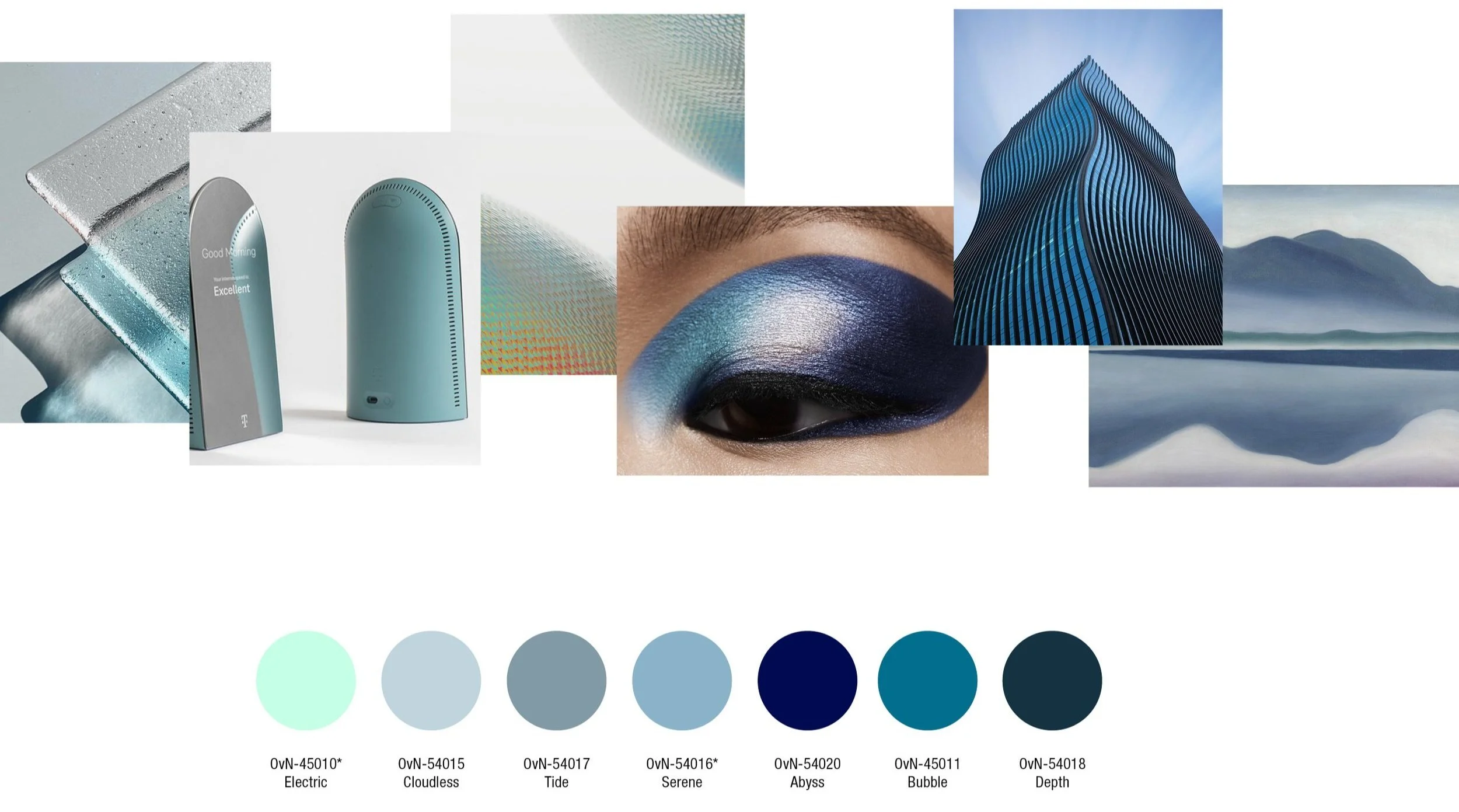
The gradated blue tones are muted; they contrast softly with the brighter tones, bringing a sense of tranquillity, light and spaciousness to the palette.
The green tones are blueish, ranging from a light mint to a dark spruce colour. They emphasise the calming effect we experience from nature and from being surrounded by trees and represent the energising effect nature has in rebalancing our hectic lives.
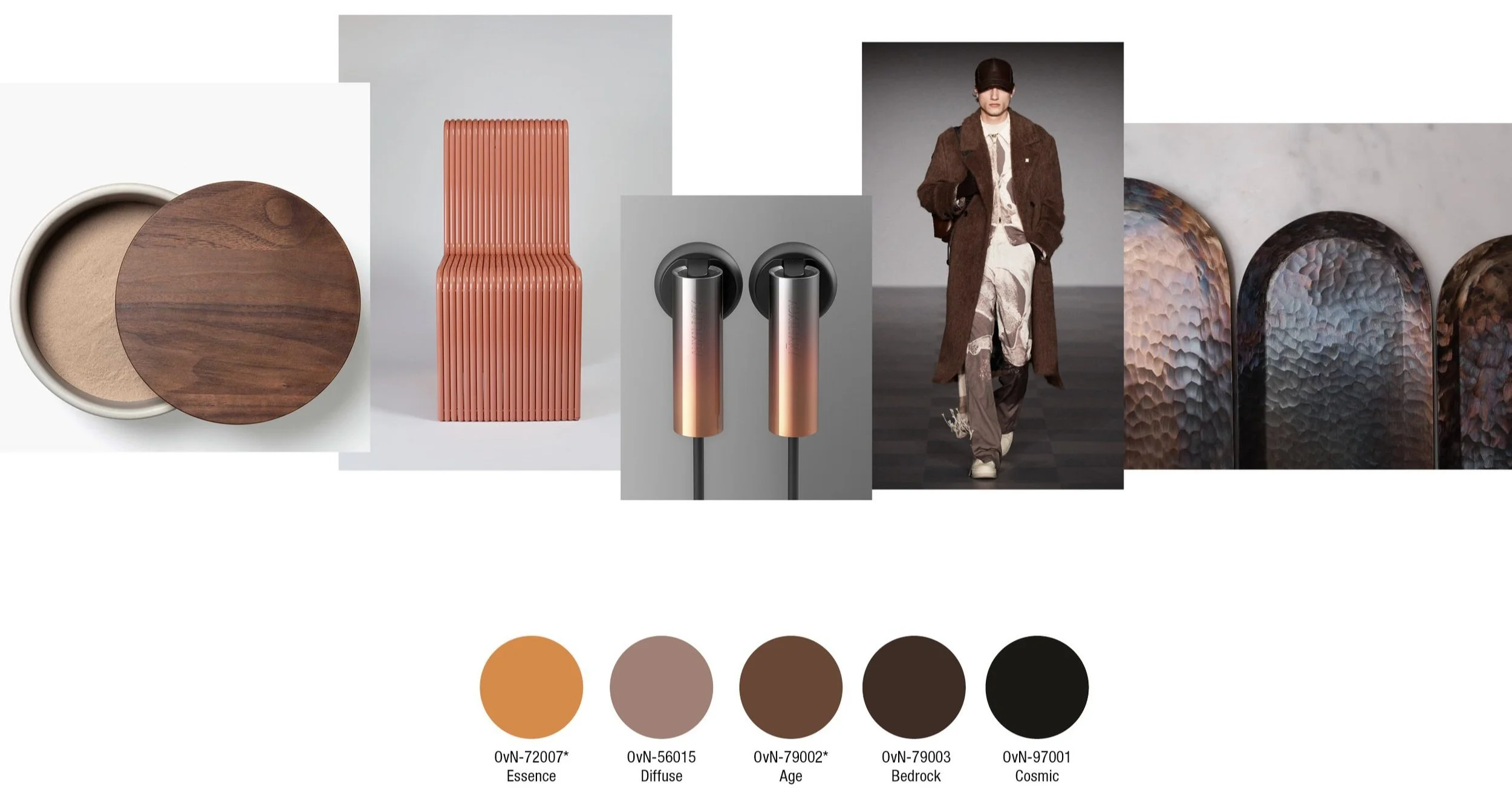
The dark tones range from dark green to blues and brown. They can be used to replace black, adding depth, elegance and atmosphere to darkness.
The 16 colours of the Vision 2024 book can be combined with the 40 shades of the Colour Flow 2024 palette with fully harmonious results.
Colour Timing
SEASONAL AND NON-SEASONAL COLOURS
The majority of the colours are season-less. This overview shows you the season-less colours and the range that are specific for SS 2024 and the range that is suitable for FW 24/25.
Colour Evolution
2023 to 2024
In the palette of 2024 the range of neutrals is followed up by a wide spectrum of golden-yellow tones, ranging from just a hint of yellow to orange tones.
For 2024 the range includes more reds, the oranges are warm and the range of pinks to full bright red is tonal and strong.
The green colours of 2024 have more blue in them compared to the 2023 palette, they are more muted and form a gradated, balanced range.
The lilac tones for 2024 are lighter, more greyish and dusty. Calming blues add lightness and a peaceful feeling to the range.
Colour Groups
Tones & hues
Neutrals
The neutrals for 2024 are light, they represent the undyed and natural and at the same time the futuristic looking colour-less and blank.
Yellow
The yellow tones are light and have a slight green tone to them. The range becomes stronger and brighter in the darker tones.
Orange
The orange tones are warm and sunny. They radiate colour and can be used as a solid colour but also in effects and shadings.
The Blues
The blues are greyish and have a touch of green to them. The Electric colour is an outlier, it adds energy and light.
Greens
The greens for 2024 range from fresh yellowish-green to a range of blueish greens. The dark green Biome is an atmospheric alternative for black.
Pinkish to Orange Red
The red tones start from dusty pink and gradually become more intense and warmer. The bright orange red stands out and attracts attention.
Grey to Lilac
The grey to lilac tones are light and hazy. They represent the effects of reflection and light, in the physical and digital. The Realm and Magic tones are more intense.
Browns to Black
The brown tones play an important role, two of them are key colours. They give warmth to objects and materials and makes them feel grounded.
Regional Colours
EUROPE
The colours for Europe are softly muted, amiable and unassuming colours. When a new product is being developed, the impact on the environment will be calculated and the colours are chosen for their neutrality, durability and being easy to mix. Orange is the brightest, most optimistic colour of the Europe colour palette and is a colour that calls for action.
Regional colours
Asia Pacific
The colours for Asia Pacific are warm, neutral and nature-inspired tones. The colours speak an universal language and are not limited by current barriers and views. The palette is balanced and harmonious, warm and timeless. The colours are natural, yet have a futuristic touch. They represent a future that everybody can be part of, connecting the past, present and future.
Regional colours
North & South America
The colours for North & South America evoke the night with dark brown and blue midnight tones. The green is an important reference to nature among the other more industrial colours. The dark brown, blue and universal grey are timeless, functional and protective tones. The palette represents new energy and new ways of thinking about mobility.
Regional colours
Middle East, Africa
The colours for the Middle East and Africa range from brown to pinkish red, purple and warm neutral; they are warm, expressive and colourful tones. When used as a shading, the violet and reddish twilight hues impart a reflective sunset glow. This mysterious and elegant warm glow changes with the light.
You can find the Regional Colours update here


