Colour
Roots of Renewal
Resilient Contrast
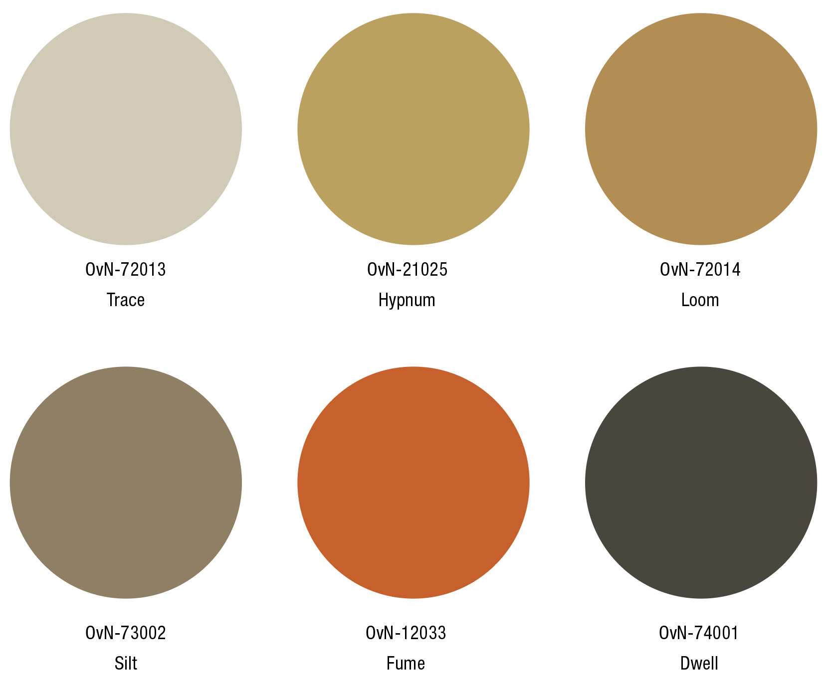
The palette of Roots of Renewal is based on neutrals that range from browns to a dark grey. The palette is a shift from last year that was based on greens. The 2027 range is inspired by the Earth, clay, rock and wood. A camouflage palette that can adjust to rough terrains without trees or foliage.
The orange-red colour is a warning, it stands out and attracts attention. This colour is not just an accent but a statement, symbolizing the critical state of the planet and the need for awareness and change. A reminder that time is pressing, and action is necessary.
The dark grey tone sets off the other shades and emphasizes their nuances. This grey is not flat or lifeless, it carries undertones that shift depending on the light, adapting to its surroundings. It serves as a bridge between the warm browns and the bright orange-red, reinforcing the contrasts while maintaining cohesion. It mirrors the role of shadows, defining form, adding dimension, and creating a resilient base.
Image in header, Meteoric Formation by Belinda Gredig
A range of natural, adaptive tones evoke the resilience of the Earth while highlighting the need for resilience.
Roots of Renewal
Trace
OvN-72013
Pantone 14-0108 TCX
RGB 210-203-180
The earthy beige, Trace, evokes the feeling of weathered Earth, providing that connects the palette to natural, raw textures.
Left to right, Negotiating Boundaries by Lotte Wigman, Canvas backpack by Not Less or Equal
Hypnum
OvN-21015
Pantone 15-1132 TCX
RGB 193-160-84
Hypnum is a gold-like hue that blends dry warmth with nature’s growth. It works well in smooth surfaces as well as in rough textured surfaces.
Left to right, Incurved Terrain by Studio Eidola, Jacques Adnet table, textile by Seachang
Loom
OvN-72014
Pantone 17-1134 TCX
RGB 185-140-75
The colour Loom adds depth and earthiness to the palette. It is warm and rich and can be used in matt as well as shiny materials.
Left to right, flax field photo by Artur Widak, Umbra 53 by Olga de Amaral
Silt
OvN-73002
Pantone 17-1118 TCX
RGB 145-127-98
Silt captures the essence of the soil, grounding the palette with its raw, organic richness and strength.
Left to right, natural flax fibre by Enkev, Tian en Tomas II by David van Dartel
Fume
OvN-12033
Pantone 16-1448 TCX
RGB 214-89-22
Fume draws the attention with its intensity, symbolizing urgency and stirring a sense of awareness in the face of pressing challenges.
Left to right, Árvore da Vida by Joana Vasconcelos, photo by Klättermusen
Dwell
OvN-74001
Pantone 19-0405 TCX
RGB 72-70-60
Dwell, a darker, muted brown, has a grounded stability, it is timeless and natural.
Left to right, photo by John Chiara, Comme Un Lego I Table by Emmanuel Boos


