Colour SS 2024
Update September 2022
Spring/Summer 2024
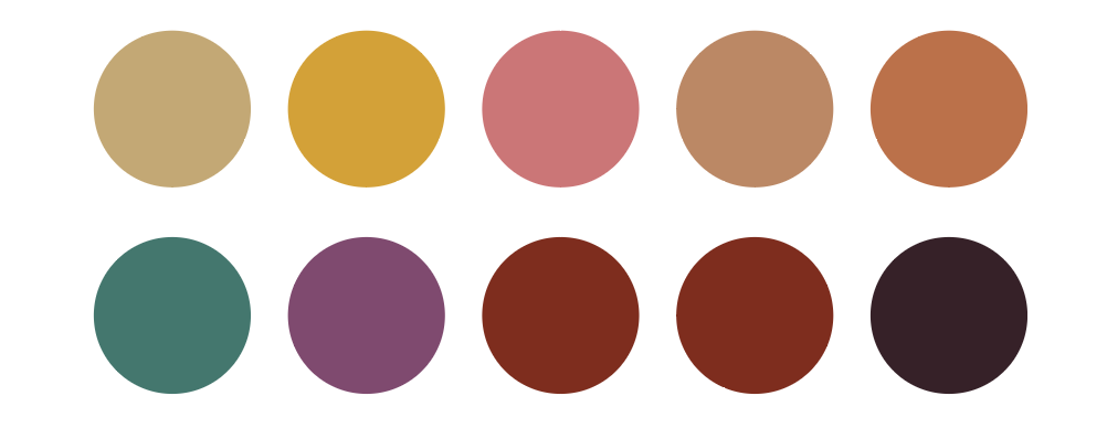
Welcome to the Colour Flow Spring/Summer 2024 colour update. The sixteen new colours for Spring/Summer are an extension of the colour palette of Colour Flow 2024. The colours join in with the general palette, they can be combined with and added to the 2024 colours. The colours have evolved since the general palette. In general, they are an attempt to create balance and cohesion. The palette emphasises mid-tones in orange, purple and blue.
Here you see the palette arranged tonally. In Colour Flow 2024 the yellow and golden tones already represented a wide spectrum, for Spring/Summer 2024 this continues and emphasises the rich orange tones. The purple and blue tones were dusty in the 2024 palette, in the updated range they become darker and purple starts to play an important role.
The palette avoids contrasts and clashes. The colours flow and have a natural feeling to them. For Spring/Summer these are not light tones, they play a role in absorbing light and warmth. The four colour stories are about a new stage of humanity, communicating through colour, connecting to the Earth and natural power.
SS 2024 TONAL PALETTE
You can download the Adobe ASE palette here and download the PDF version here
Click here to see the non-seasonal and summer 2024 colours of the original Colour Flow 2024 palette.
1/State of Soul
Being present
Original palette Mythopoetic
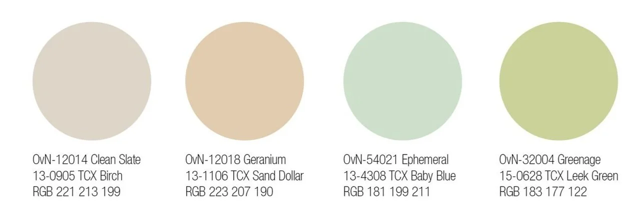
State of Soul represents a new stage for humanity. Making the everyday special, adding magic and poetry. These colours focus on the experience of the colour and the material. The colours ask us to slow down, to reconsider and be present. The senses of our soul; intuition, peace, foresight, trust and empathy are addressed by a new sensitivity that asks us to be more present.
About the colours:
The colours are light and take a new look at what is natural. They are subtle tones, classics but with a new delicacy to them, low-key yet special. The Clean Slate colour is a soft and warm neutral colour with a touch of red. The Geranium tone is a neutral with a glowing salmon touch. Ephemeral is an airy blue with a green touch and the Greenage colour is fresh and Spring-like.
Left to right, facade tiles by Vivian Tamm, Marine Serre, sculpture by Kristi Cavataro, Marine Serre, Ruínas paisagem by Manoela Medeiros, Ranra, Amiri, Maria McManus
2/The Language of Abstraction
Colour expressions
Original palette Interconnectedness
Communicating through colour is an abstract language. Shapes of colour are neither figurative nor culturally specific nor political in the traditional sense, they convey a universal message. The Language of Abstraction is the ability to absorb information from our senses and make connections to the wider world. In a world of data, these colours speak to us in a different way. They express warmth, these colours speak through material use, craft and colour blocking.
About the colours:
These colours represent an open form of expression. The Chamarel colour is an earthy pigment that is warm and fresh at the same time. Pitaya is bright and expressive, it catches the eye and draws attention. The Redwood colour is a reddish brown, grounding and warm. Finally, the Purple Sky is a new dark tone, a rich deep purple, representing creativity, mystery and spirituality.
Left to right, Kwangho Lee Studio, Dries van Noten, top by Sea, Lukhanyo Mdingi, Speak the wind by Hoda Afshar, JW Anderson, painting by Fanny Sanín, Kolor
1/Geologic Time
The history of the Earth
Original palette Renewal
The four new colours for Geologic Time are darker tones compared to the general 2024 palette. The colours represent a grounded, more humble approach that is non-seasonal. Geological time portrays the history of the Earth long before humans inhabited it. Long-term colour use is needed to prolong use and slow down consumption. Connecting to the Earth makes us aware of its existence before us and our impact on it’s future.
About the colours:
The four colours are greyish and muted. They can be used together but also work well as solids. Blue Aragonite is a mineral colour with a timeless feeling. The Purple Ochre is dusty and greyish, a muted tone that can be used for a wide range of uses, from sportswear to electronics. The Celestine is a greyish blue with a slight purple tone, it combines cool and warmth. The last colour, Carat, is a deep dark grey that adds interest and richness when used instead of pure black.
Left to right, painting by Chiura Obata, Strata by Dean Kissick, Reese Cooper, Jil Sander, Children of the Discordance, Julia y Renata, Swivel by Sabine Marcelis, Pebble Rubble by Front for Moroso
4/Metaphysics
Redefine reality
Original palette Distortion
Metaphysics is about the fundamental understanding of reality, including the relationship between us, the Earth and our future. We reevaluate what we are and what our purpose is. These colours have a climate tech element to them, technologies future focus. Natural power is used to transform societies and our way of living. We have to adjust to new standards and new ideas about finite resources and focus on innovation to create a new world of natural abundance.
About the colours:
The colours are inspired by nature and technology, this is where nature and high tech meet and new standards are being created. The Helios colour is light and friendly, it beams light and energy. The Jupiter colour has a warm glow, it is a colour of natural phenomena that spread throughout the universe. The blue Hydro colour is the colour of blue energy and the power of water. Deep Violet is a pigment that can be created through biotech dyeing methods and using bacteria.
Left to right, sculptures by Zegna, Anicka Yi, T4 by Holloway Li for Uma, Raeburn, Marni, photo by Clavel Sandrine, Craig Green, Marni
Banner image, painting by Sara Berman
If you would like to order the 16 swatches of the SS 2024 palette you can contact us here


