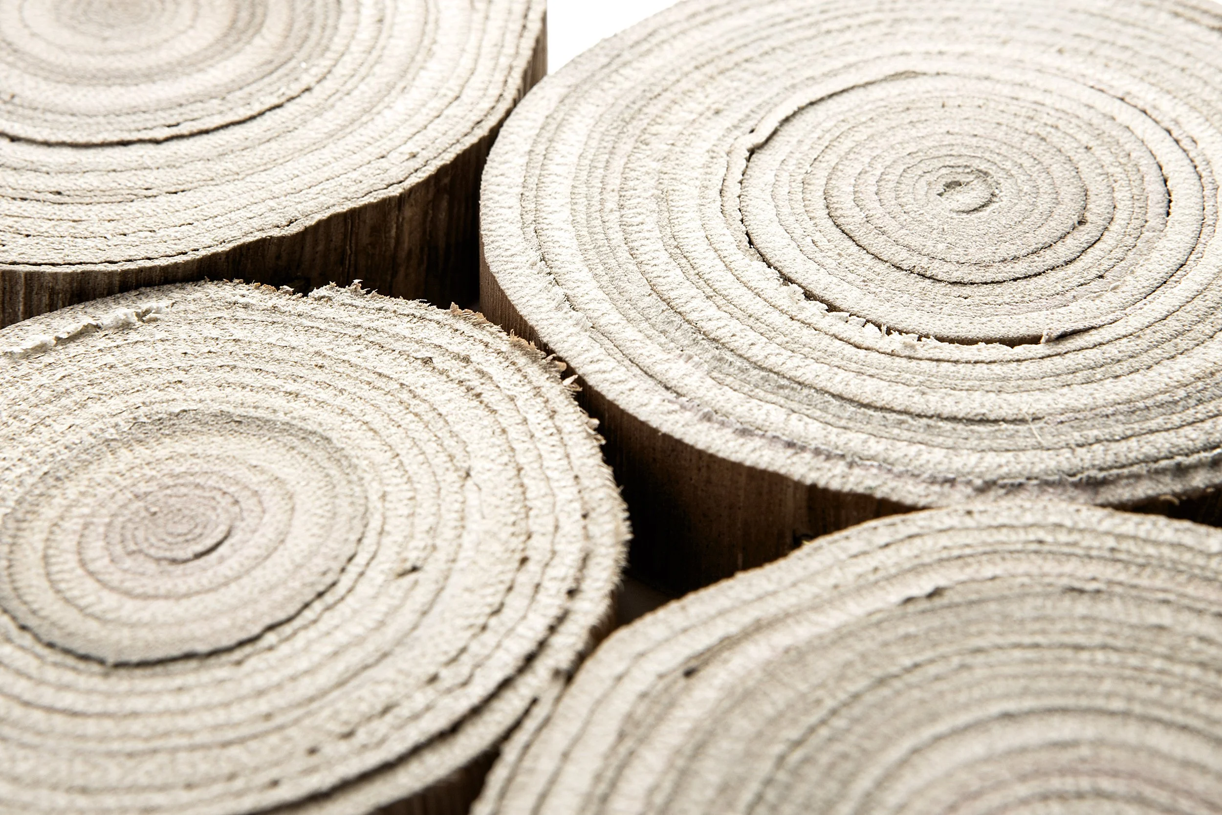
2 Turning Point
Colour
2 Turning Point
Source
Diversity in design
Turning Point expresses the appreciation for human existence on Earth and the search for connection, cooperation and cohesion between continents, people, materials and local crafts. Diversity in design and influences from the wider world evolve into a new aesthetic. Acknowledging the gaps in the design world and making space can lay the foundation of a world of design based on something truer and richer than before. By listening to each other, it is possible to seize the unique opportunity to realise a future of design that encompasses the whole world.
Perspectives
The world is becoming more polycentric, with different perspectives. New cultural influences will require and create attention to detail, providing a 'no size fits all' policy. There will be a separation between global and local identity, both diversified and essential for laying the foundations for progress. More importantly, being visible and validated with regard to cultural identity and gender expression connects us all in human soul and spirit.
Social change
The materials and products of Turning Point are a labour of love; they take time and care to create and are almost like personal stories. Craft and craftsmanship are part of the foundation of human existence and can strengthen communities around the world. Intensifying the focus on constructions and upcycled materials will create a pillar of stability as a central, uniting feature in future manufacturing processes. Textures and effects will emulate a warmth that is comforting, accepting, and diversely applicable across many disciplines.
Reality
The colours for Turning Point reflect reality. The concept is based on working with materials that are already available for use; no new raw materials are used. There are traditional techniques and hints of cultural elements embedded in the evolution of the materials, with over-dyeing and upcycling being the main contributors. The colours combine modesty with vibrancy, energy and taking up space. Each colour can be strong on its own or form a collective and separate identity in combination with others.
Download Adobe .ase file here
About the palette
The colours are inspired by nature; the palette basis is made up of primal tones that have been part of the earth's history for millions of years. They are inspired by natural pigment colours, earthy stains, dyes and hues extracted from techniques of diverse heritages and cultures. The palette can be seen as a vessel conveying important features of human identity and its origins. These colours provide a legacy that can become the foundation for future designs. The yellow ochre shades are warm and sunny while the Oxide Grey, Grain and Perspective colours are more neutral. The colours Sundown, Being and Azur impart energy to the palette.
Key Colour
Contemplation, a warm light neutral colour, it embodies a sense of calm and introspection.
Colourways
Bi-colour
The bi-colour colourways bring colour to the warm neutral and brown base tones.
Athmosphere
Lilac and grey with a purple tone play an important role in this colourway.
Pigments
This warm creamy colourway brings together als neutrals.
Golden
A yellow to brown colourway that brings the warmth of the sun to materials.


