Colour SS 2025
Update September 2023
Spring/Summer 2025
Progression and emotions
Welcome to the Colour Flow Spring/Summer 2025 colour update. The sixteen new colours for Spring/Summer are an extension of the colour palette of Colour Flow 2025. The colours join in with the general palette; they can be combined with and added to the 2025 colours. The colours have evolved since the general palette of 2025; they have become more intense and are a stronger statement of colour and the accompanying emotions and associations. Here, you see the palette arranged tonally.
For 2025, the world of colour relates to the future of human connection and consciousness. The colours support a need for tranquillity and a commitment to sustainability. Not only for shaping our environments but also our thoughts and values, ushering in a future where colour becomes a lens through which we explore the interconnectedness of the world, society, and our inner selves.
The tonal variations within the red and blue colour directions allow for a more profound exploration of the emotional effect of and the symbolic meaning associated with blue and red. The light and neutral tones represent a more humble approach to life, while the bright tones emphasise our need for play, joy and life’s energy.
SS 2025 TONAL PALETTE
1/Cosmos
Calming Nature
Cosmos embodies a soft and natural palette that has a sense of peace and tranquility. The soft, muted tones evoke a serene atmosphere for creating spaces that soothe the soul. The commitment to sustainability distinguishes the colours, these colours have the intention to leave no environmental traces or carbon footprint and they are a harmonious choice for a conscious and environmentally friendly lifestyle. Energy, our living energy source, finds a kindred spirit in the Cosmos.

The colour story is a carefully curated palette with a delicate pale yellow that evokes the freshness of nature, a serene grayish hue reminiscent of peaceful cloudy skies,  a super soft pink that radiates a gentle warmth, and a dark brown-grayish hue reminiscent of soil and clay. These harmonious shades look best in natural materials, such as wood, stone and textiles such as organic cotton, linen and hemp. The dyeing technique affects the lightness of the shades, but can also be used to emphasize irregularities and texture.
Left to right, Grown Blur by Boqun Huang, photo by Romain Duquesne, Rachel Comey Spring 2024, Jason Wu Collection Spring 2024, photo by Doen Studio Rotterdam, Altuzarra Spring 2024, Taburet by Fritz Hansen
Original palette CF25 Horizon Scanning
2/Radiance
Earthly resonance
The colours of Radiance consist of earthy hues, primarily embracing deep red and red-orange tones that gradually transition into a reddish-purple. This colour narrative resonates with the essence of nature, mirroring the vibrant tones of the sunsets. Radiance is a feeling of warmth translated into tactile materials, where cotton, wood, straw, and rope come together to form a mix of textures and sensations.
The connection to the Earth is communicated throughout Radiance, a reminder of our symbiotic yet troubled relationship with the planet. Radiance isn’t just a colour story; it is a celebration of the beauty and harmony found in nature, a reminder of the balance that can be discovered when we reconnect with the world around us.
Left to right, Faye stool by Mathias Hahn, Summer Nights by Pierre Yovanovich, Sea Spring 2024, Highlight collection by Nicky Vollebregt, Denzil Patrick Spring 2024, XIV Red Patience by Emma Fitts, Timber Chair by Onno Adriaanse, The Row Spring 2024
Original palette CF25 Turning Point
3/Ethereal
Digital tranquility
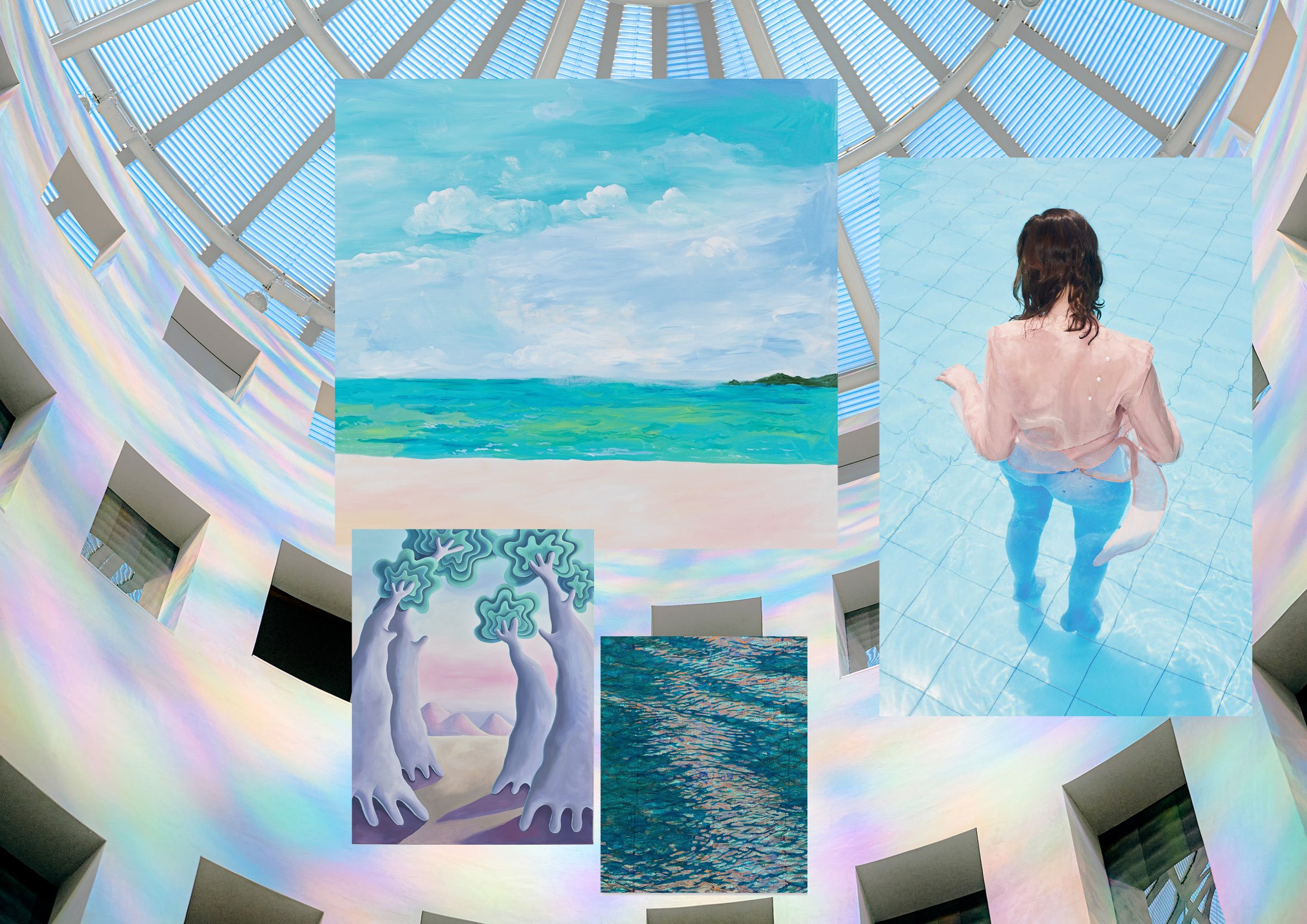
Ethereal is a symphony of blue hues that evoke a sense of dematerialization and weightlessness. This palette transports our imagination to a realm where time seems to dissolve. Each shade in this ethereal spectrum looks like it moves beyond the boundaries of physical form. The gentle transition from deep midnight blues to delicate azure-like tones mirrors the ever-changing nature of the sky.
The Ethereal colours evoke a sense of limitless possibility. It’s a story told in colours, where the weight of the world is lifted to be free to explore the intangible realms of imagination and dreams. It reminds us that even in our digital age, we need space to breathe, relax and be still.
Left to right, Eudon Choi Spring 2024, What remains at the ends of the earth? by Imani Jacqueline Brown, Open Square by Luftwerk, Concrete chrome – solid ether by Jammie Raap, Rachel Comey Spring 2024, Trans Moment by Yuji Tsutsumida, Staud Spring 2024
Original palette CF25 Alignment
4/Spectrum
Interplay
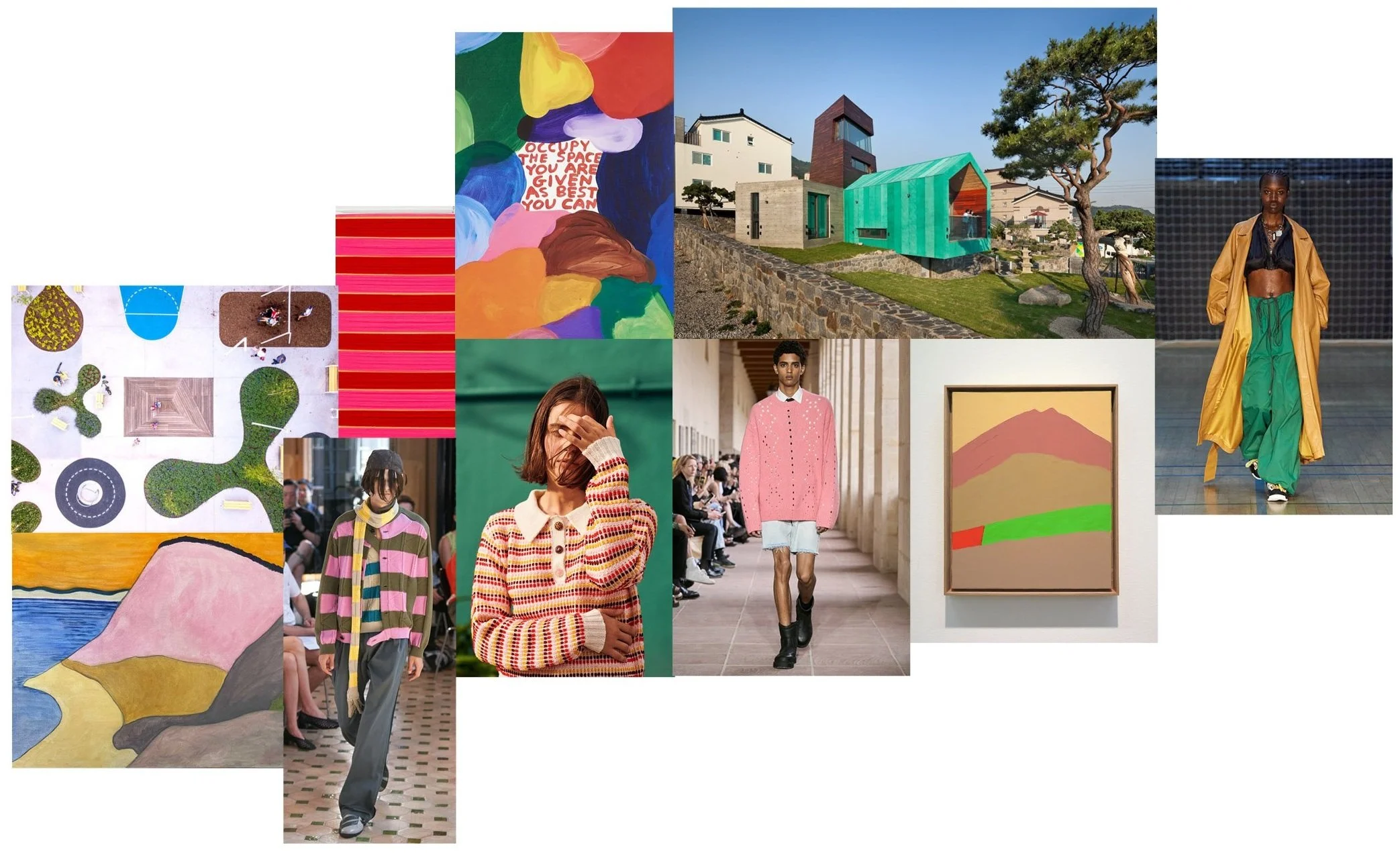
Spectrum is a vibrant and energetic colour story that embodies the essence of playfulness. It draws inspiration from a spectrum of colours that evoke a sense of nostalgia while remaining refreshingly contemporary. These colours blend the signals of basics and cultural codes, creating a visual language that attracts attention in our complex, overloaded world. In an era where clarity, simplicity, and intuitive interaction are highly coveted, the colours of Spectrum emerge as a tool for simplification through colour.
The colours blend the old with the new, symbolising cultural norms that have stood the test of time. In a world of complexity and ambiguity, Spectrum is a testament to the enduring power of colour to inspire and guide us, offering a vibrant beacon of hope and clarity in our daily lives. Its clear lines and vivid hues help us navigate the intricacies of modernity through bright, playful statements.
Left to right, Activity Zone by SLAS architects, Painting by Rosemarie Trockel, Occupy the space you are given as best you can by David Shrigley, Tower House by ON Architecture INC., Dunes by the Sea by Sally Michel Avery, Kiko Kostadinov Spring 2024, Mismatch Polo Sweater by GiGi Knitwear, Givenchy Spring 2024, Painting by Etel Adnan, Stamm Copenhagen Spring 2024


